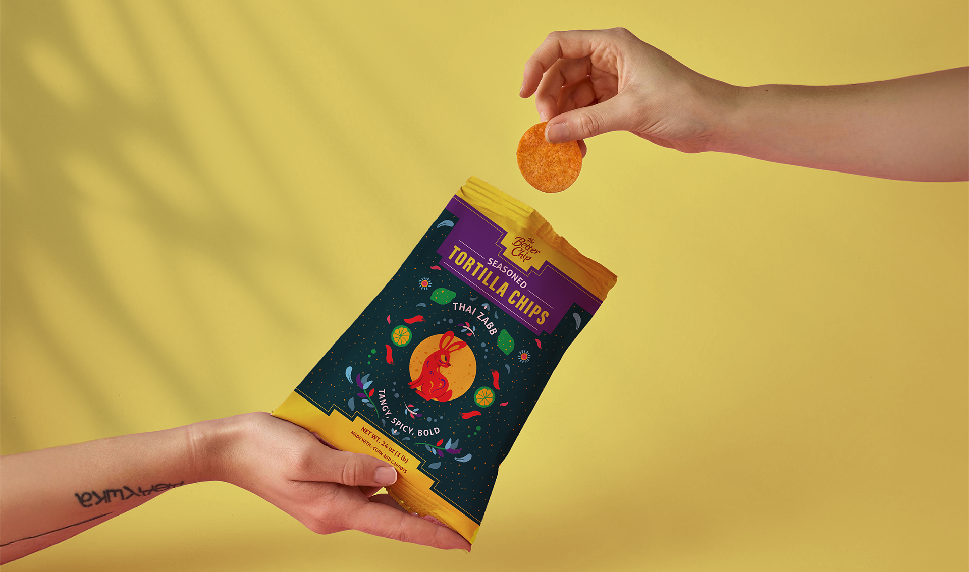
The Better Chip is a brand of American tortilla chips that comes in a variety of flavors such as Thai chili, cumin seeds and hot honey.
Planning on a relaunch for the brand, they wanted to keep the logo but develop a new, bolder aesthetic for the packaging inspired by it's mexican flavors.
Client The Better Chip
Industry Food
Location USA
Services Graphic Design, Illustration, Packaging
Team Studio Zak
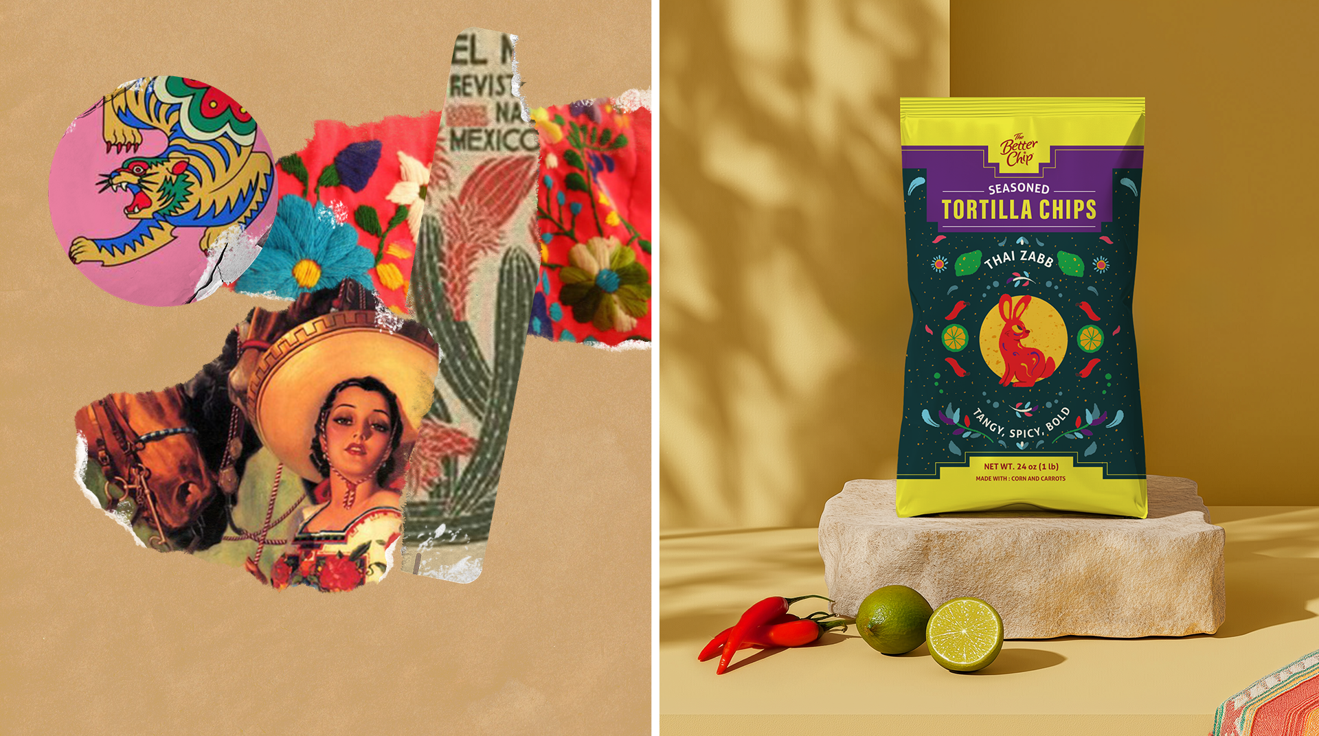
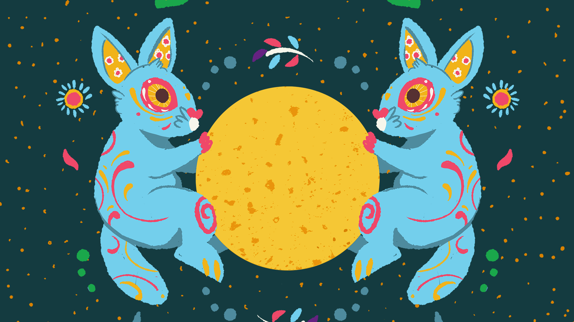
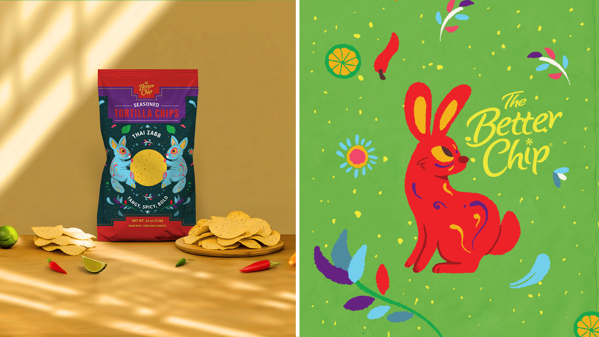
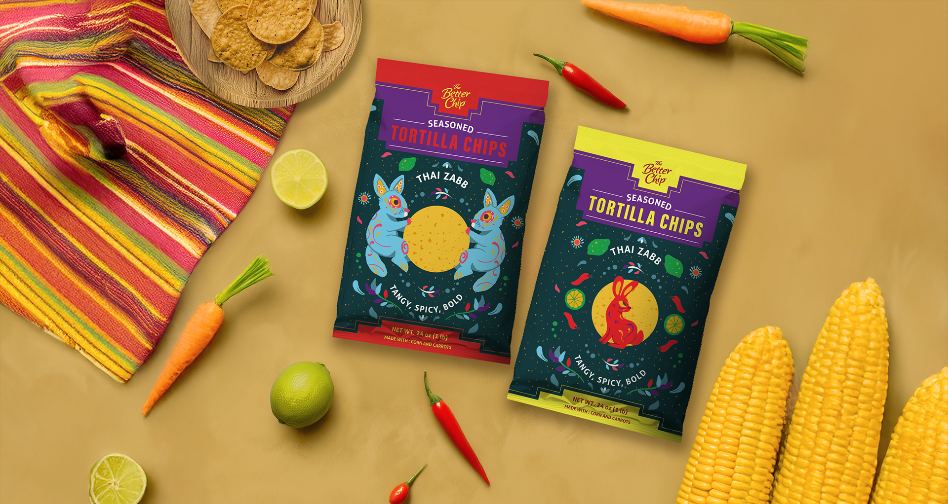
There were two concepts that they asked to be included in the design: a rabbit (symbolizing curiosity and the carrot, one of their main ingredients) and a moon (representing the chip's round shape). This was inspired by the Moon rabbit, a mithology shared between East Asian and indigenous American folklore.
These were the two concepts I designed as part of Studio Zak. The client ended up choosing a third option, but I'm still very proud of how they turned out.